You’ve all probably heard of the Golden Ratio or the Golden Rectangle, which has sides in proportion to the Golden Ratio.
The remarkable mathematical property a Golden Rectangle has is that its long side divided by its shortest side is exactly equal to the ratio of the number of bullshit claims about the Golden Rectangles compared to truthful ones.
Sure the Golden Ratio is a real thing. It is useful for producing spirals, ISO-standard paper sizes [Stop Press: I WAS WRONG! See comments], and interesting mathematical puzzles.
But the claims that it is some biological ideal of beauty or perfect design seems like unjustified crap to me.
What evidence is provided?
That ancient architects have used it to design buildings. Maybe. So? How would you prove that if they made them just a little bit wider they would be any less beloved?
That some pretty faces can have spirals and golden rectangles drawn on them? Every time I have seen such examples, the lines on the rectangles cross up in completely arbitrary points on the face. If you used a ratio of 1.6, or 1.8 or 2.0 you could also get similar results from pretty faces – especially if you are permitted to select your own faces for the experiment.
The result is we get designers constraining themselves to arbitrary rules, and then feeling proud that they did so.
What triggered this rant?
The New Twitter design team claim they were influenced by the Golden Ratio (except if you have a browser window that is larger than the minimum, of course.)
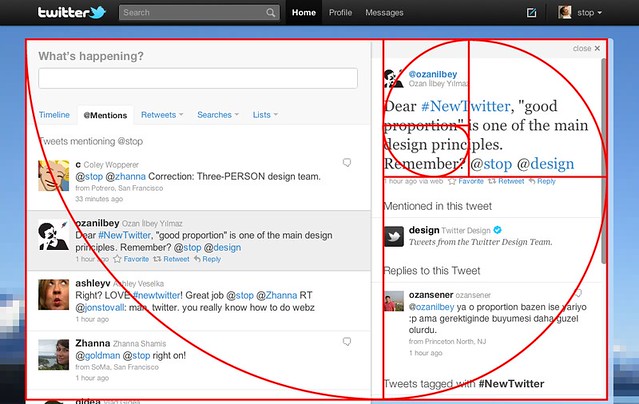
Pretty, right?
Lets look at the claim closer. The spiral starts at the top left corner, and touches the bottom surface at the division between the left and right panes…. Wait, no it doesn’t. The right-hand pane is too wide.
Then it extends touch the right-hand-side at the bottom of the top right pane. But wait, where is the bottom of the top-right pane. Is it the bottom of the word “Remember”? The top of the words “1 hour ago”? The bottom of the words “1 hour ago”? The top of the words “Mentioned in this tweet”? How is my eye supposed to know which they arbitrarily decided when Twitter made the design? Should I even believe it was ever considered by the team, and not just arbitrarily claimed later?
Then the spiral touches the top of the screen at the point that lines up with… um.. nothing in particular.
Then it keeps going to touch halfway through the word “proportion” for no reason. Why is the spiral still being drawn?
But no, it keeps going to touch under the gap between “m” and “b” in “remember”, which is beautiful. Then it pushes right past the “i” in “principles”, which is surely some sort of metaphor. Finally, it stops in the middle of the “n” in “proportion”, which is surely some form of ideal point, justified by the ancient Greeks.
Also note:
- the left column is extends longer than what is shown
- the right column appears to be truncated (there is no content under the heading “Tweets tagged with #NewTwitter”
- I suspect the other content on the right is actually dynamic in size, so the ratio won’t apply when it becomes smaller or larger
- the “close” button should take up a majority of the top right pane, in order to properly follow the ratio.
This entire claim that the Twitter design follows the Golden Ratio is completely bogus. I don’t know if they really did try to use the ratio, but I see no evidence that they succeeded, and I hate that they have set up in the minds of the next set of designers that such a constraint is a good idea to improve user opinions.
Comment by Sunny Kalsi on October 1, 2010
Why is this comment not posting?
I like new twitter’s feature set, but like you I wasn’t too sure about the golden ratio there. First, it requires my browser window to be wider than my monitor (my monitor is vertical). Second, on my browser the design is “mostly” fixed, but the right column resizes slightly, which can sometimes move the “trends” into one column instead of two. I don’t know why it’s slightly flexible like that when the rest of the site clearly isn’t.
Also, if you enlarge the image and hold an A4 piece of paper up to one of the rectangles you’ll realise that the spiral is not the golden ratio. So.. yeah… I’m looking for an explanation here as well.
I recently adjusted my site so that it works in a wide variety of situations. For a good time, go to that page and change the width of the browser window. Whee!
Comment by Julian on October 1, 2010
Not sure why you had posting problems, sorry.
Your observation that it isn’t even a Golden Rectangle is hilarious. Well-spotted.
Comment by configurator on October 1, 2010
But A4 paper don’t have the golden ratio. A4 (and other As) have √2 ratio.
Comment by Sunny Kalsi on October 1, 2010
Configurator: You’re absolutely right. It appears the ISO “A” standard is not based on the golden ratio after all. This is fairly amazing because both Julian and I were under the impression that the ISO standard sizes were based on the golden ratio. I have no idea what’s going on any more.
Comment by configurator on October 2, 2010
@Sunny: I don’t know where you two got the impression.
The idea behind A* having 1:√2 ratio is simple, by the way. Fold an A4 in two, and you’ve got A5, which has the same ratio. Same with all other sizes A0-A10, and other standards B* etc.
Comment by Julian on October 2, 2010
Configurator: Ha! This is even more hilarious.
I knew the paper ratio was √2. I knew that √2 was different to φ. But I didn’t put two and two together – or should that be two and √2? 🙂
I blame the magical power of the Golden Ratio for the error: it was ensuring the bullshit claims on this page were in the right proportion.
On the plus side, I didn’t claim the Nautilus shell followed the Golden Ratio. I have a vague recollection of a science writer or documentary maker wanting to illustrate the Golden Ratio by drawing a spiral on a photograph Nautilus shell and discovering it didn’t follow the ratio at all. I haven’t found that story, but while looking I discovered several other arguments, which even throw doubt on the “ancient architects used it” claims.
Comment by Nemo on October 4, 2010
I’ve been ranting against the myth of the Golden Ratio beauty for years. Thankyou for more supporting. I salute you sir.
The observation that I tend to make is that most ‘draw a spiral on a ‘ is usually done in low-resolution gif/jpg where the pixelated error margin on ‘measurements’ is likely to be a few percent of the whole, and then to consider that the difference between φ and Ï€/2 is also only a few percent. Where is the “design everything to a ratio of 1:Ï€/2 !!!” crowd?
I wonder if anyone ever done a wide ranging survey asking people their favourite rectangle proportion. An AJAXy ‘resize this widget till you like it most and hit submit’ has occured to me before now, but I’ve not bothered into any implementation watch
Comment by Alan Green on October 16, 2010
It should not be surprising that people think so fuzzily about the Golden Ratio: it is fundamentally irrational.
Comment by Aristotle Pagaltzis on December 10, 2010
http://24ways.org/2010/golden-spirals