Introduction
If you are a programmer, and haven’t heard of the Q&A site, StackOverflow, remedy that immediately.
Inspired by a post there, I wrote a simple web-crawler that looked at the age, membership length and reputation of the users of StackOverflow.
I describe the method below, for people who like hearing about software. I graph the results below for people who like looking at colourful graphs. At the bottom, I have a quick conclusion for people who just want the summary.
Method
I wrote a simple Python script that fetched each user’s profile page, and snipped out the user’s age (if present), their reputation and the numbers of days they had been a member of StackOverflow. (Code and data available upon request.)
The script ran for around 18 hours around October 23-24, 2008.
Deleted users (having missing user pages) were ignored leaving 57,144 users.
Using feedback from the original post, I treated all ages 8 and below, and also the maximum permissible age of 88 as missing. This removed several outliers. People’s ages are self-reported, and may be wrong or biased. Just over 30,000 users had valid ages.
I grouped reputations into several buckets. The range of the buckets were sized on a logarithmic scale. A reputation score of 1 was put in its own bucket, as it represents the default reputation. Probably, the majority of these users are not active.
I then hastily constructed some Excel charts. I am using the default appearance for Excel charts; sorry for any perceived unprofessionalism, but this was a hasty, and unprofessional, excercise.
Results
Here are the results, presented as charts.
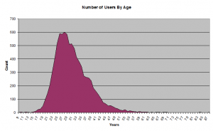
Number of Users By Age
The first graph reproduces the original post. It shows the age of the users.
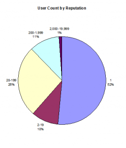
Number of Users By Reputation
This graph shows over half of the users are sitting on a reputation score of 1.
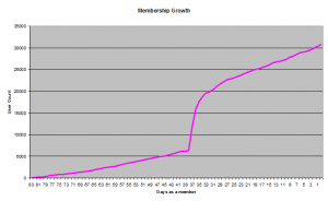
Membership Growth
This graph shows how StackOverflow has grown in terms of members. The sharp spike almost certainly represents the growth after the site moved from Private Beta to Public Beta. You may have heard Jeff Atwood and Joel Spolsky discussing this curve on their StackOverflow podcast.
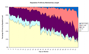
Reputation by Membership Length
This chart is a little more complex. It shows how people’s reputations are associated with the time they have been on the site.
The left part of the graph represents recent joiners. The right part of the graph represents the old-timers.
The gentle slope down to the right represents the obvious fact that, the longer you have been a member, the more likely you are to have a higher reputation.
The sudden drop downwards in the middle represents the date of the public beta starting. Data to the right of the spike represent beta testers.
One way to use it is to find out how long you have been a member along the bottom, and rule a line straight up. The different coloured sections show what percentage of people have what reputation, so you can see your very rough percentile position compared to others.
Reputation by Age
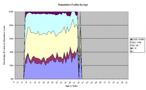
This is the result which originally inspired this project. It shows the relationship (or the lack of it) between age and reputation.
For this chart, I removed all ages which had less than 10 data points to ensure the data is meaningful. (Why 10? I used the sophisticated statistically modelling technique called “Feels about right”.)
The result seems to me to be pretty flat, within the margins of error. There doesn’t seem to be a strong correlation. (No rigourous statistical measures were harmed in the making of this assessment.)
Don’t be fooled by the dips around 16 and 54. That is just Excel’s graphing tool treating missing values as 0.
Summary/Conclusion
Users of StackOverflow who aren’t reticent to share their age are mainly in their late-twenties to mid-thirties, with a moderately long tail towards retirement age.
About half have a reputation of 1. Another quarter have a moderate reputation between 20-199. The top 1% have reputations above 2,000.
The longer you are on StackOverflow, the more likely you are to have a higher reputation. Duh! Beta testers were more likely to be active users (reputation-wise) than the general public. Double duh!
Age (within the typical ranges) doesn’t have a big influence on reputation. Outside the typical ranges, there was insufficient data to be sure.
Comment by Richard Atkins on October 24, 2008
‘Tis a pity the colour scheme isn’t consistent across all the charts. I might be misreading the age/rep% graph, but it looks like there’s some sorta interesting data points at 38 and 51 – these correspond to the highest and lowest proportions of high rep users (> 200). I’m guessing the 51yos are simply underrepresented at ~20 users, but what’s with the ~200 38yos? They seem to have higher rep as a percentage by 5% over everyone else. Is there something special about people from Epoch?
Comment by Asd on October 25, 2008
A scatter plot might be more revealing for the last one.
Comment by Julian on October 25, 2008
Richard,
Re: Colour Scheme
Yes, I agree, but I knew if I didn’t get it out by yesterday morning, I wouldn’t get a chance to complete it for several days, so I didn’t finesse the charts as much as I would like.
As a member of the Epoch Generation, of course I believe that age has a tendency towards surprisingly high intelligence, knowledge and communication skills which results in a higher reputation score. However, I strongly suspect that this is just an artifact within the normal bounds of the variability of the data.
Comment by Julian on October 25, 2008
Asd,
Scatterplots are great for sparse data-sets.
However, this one is very clumpy, with some co=ordinates on the scatterplot having over a hundred data-points. (e.g. there are 137 26-year-old users with a reputation of 1)
If there was an occasional 2 or 3 duplicates, you can put the number of duplicates at the co-ordinate instead of the cross, but that loses impact when the numbers get higher.
I have sometimes used the technique of adding a teensy amount of randomness to get illustrative clusters of crosses around the real data-point, but that stops making sense around 10 duplicates.
I don’t have any other techniques for representing this data meaningfully on a scatterplot. Let me know if you have any ideas.
Comment by James on January 13, 2009
The original code was in perl, why the change to python? Is the code that bad that its only availabe on request?
Comment by Julian on January 13, 2009
Dear James,
I’ve decided that you are probably one of those people who show their appreciation of a free gift by taking mild potshots at the giver. So, thank you very much for your kind words. 🙂
The reason I changed to Python was simple. I am not familiar enough with Perl; I am familiar with Python. This is not an attack on Perl, but merely a quirk of history that I once needed to learn Python, and to date, I have not needed to learn Perl.
There are several reasons that I didn’t publish the code. Each individual reason isn’t strong, but together they made a case.
1) It is not my default position to publish code, unless there is a reason. It is my default position to not publish code, unless there is a reason. I see no reason here.
2) The code isn’t what this article is about. The code isn’t interesting. The conclusion about Stack Overflow demographics is what it is about. The rest (including the offer to make the code available) is for scientific credibility about the conclusion, not because all software should be free.
3) I am not willing to offer support for the software. If I made it available, I was likely to get support calls.
4) Yes, the code is bad from a code smell perspective. I was in a rush, and I didn’t spend the time to make it clean, readable, reliable, maintainable, efficient, (etc.) I didn’t even spend the time to package it up. I don’t want to associate my name to the source-code. The code was excellent from the perspective of one user, in a rush, for one-time use.
5) I felt a little uncomfortable about scraping someone-else’s site without permission rather than using the API (which they said was coming, but hadn’t published at the time). If I made it freely available, I would be encouraging others to do the wrong thing too.
6) I didn’t think there would be any real demand. (In fact, I have had a total of two requests, and one person wrote back to say it wasn’t what they were looking for.)