Both Firefox and Internet Explorer 7 Beta have a tick in the “Tabbed Browsing” box on their feature list.
Tabs are really yet another weird compromise between MDI and SDI.
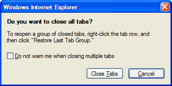
Unsurprisingly, old-school Windows users like me try to close a tab by closing a window. Finding the “close tab” icon hidden halfway along the tab bar is still unnatural to me.
Both the Firefox and Internet Explorer 7 developers gave some thought to people like me. They realised their weird hybrids were going to confuse me, and they warn me that I am being stupid…

Thanks very much for the thought, guys.
But in the respective next version, can I please have another choice? I want an option to do immediately what I really intended – that is only close the current tab.
Comment by Alastair on March 28, 2006
Safari and Camino both put a close “x” on each tab. It uses up a bit of extra screen real estate but it’s worth it IMHO. It has the added benefit of being able to close tabs without switching to them first.
Also, I think a browser is by far the most important application on most computers these days, so MDI/SDI compliance isn’t really an issue. In my book the browser has extra leeway to bend the normal UI conventions when they don’t apply. That doesn’t mean I want it to go all “media-player” with skins and non-rectangular windows and stuff. Just that tabs are just a natural addition to the browsing experience that they have justification to break the standard document models. Besides, web pages aren’t really documents anyway.
See also OmniWeb for a really cool implementation of browser tabs.
What would be even better than application-specific tabs is the ability for the operating system itself to gracefully handle navigation between 10s of different document-like pages within a single application, be they tabs or MDI child windows, or SDI windows, (or other OS equivalents). Neither XP nor MacOS X really does this right.
Comment by Pete on March 28, 2006
Julian, you make it sound like SDI and MDI are two ends of a continuous spectrum. They aren’t. Think UIs like classic VB and Delphi IDEs with their multi-window yet not MDI nor SDI model (yes, many apps modernised this into SDI + tool windows – but that still isn’t straight SDI). In one sense you could think of tabbed-windows as a different style-sheet (like CSS for HTML) for MDI windows – where the tabs are an alternate rendering of the MDI Window menu.
BTW Old-school windows users should know the “old-school” keyboard shortcuts like Ctrl+F4. Younger folk would also be aware of Ctrl+W which seems to be the “modern” shortcut. Both work in firefox – and I believe in IE too (but I haven’t tried Exploder 7 yet).
Further – if you use tabs in Firefox then you are likely to “middle-click” on links in order to open the link in a new tab. Did you know you can “middle-click” on the tab to close it?
Alastair: what you describe is very similar to what the tracker in BeOS used to do. It was a bit like the way that XP can merge application instances into a small menu in the taskbar – except that it worked.
Comment by Aristotle Pagaltzis on March 29, 2006
See Tab X.
Personally I dislike that style; having a single tab-close button means I don’t need to locate the focussed tab in the tab bar in order to close it – less thinking, less aiming. I can still close unfocussed tabs by way of the tab context menu.
That is not to say I think the single-button style is better. They simply have different affordances. I can see in which ways the button-per-tab style is better and why someone would prefer it, but to me, the ways in which the single-button style is better are more important.
Comment by Julian on April 1, 2006
Alastair,
So does IE7 Beta 2, except when you only have one tab left. That means if have 6 tabs, and I delete 5 tabs in a row, I have to suddenly change my technique to delete the sixth one. I think I agree with Aristotle’s comment here.
That comment got me thinking!
I believe that traditionally, Microsoft have used Outlook as playground to beta-test new user interface techniques. It’s not been their only place, but its often been at the forefront of ideas that get pushed back to the rest of the OS and applications later.
So, doing it in IE is a break with tradition. Then again, releasing new versions of IE is a big break with tradition, so why not use the browser as the flagship for new UI ideas?
After some more thought, I realised I had an objection. Don’t try high-risk novel usability tricks on software where everyone has to use it. Try it out first on a tool that’s optional.
Okay, okay! The Firefox, Opera, Lynx and other users can settle down now. I appreciate that there are perfectly valid alternatives to IE. I even have a few installed on my machines. Not everyone has to use IE. However, I don’t think that undermines my point here.
What undermines my point fair more strongly is that many alternative browsers, including Opera and Firefox, have already “beta-tested” the tabs functionality, reducing the risk to Microsoft of copying them.
So I remain conflicted here about whether I am happy for the most common application to deviate from the self-described standards and conventions of the OS.
Please elaborate – I don’t see why they don’t fit into the normal (very broad) definition of documents.
Comment by Julian on April 1, 2006
Pete,
Let me get the trivia out of the way first. IE7 Beta 2 duplicates the shortcuts you described: Middle-click a link to open in new tab. Middle-click a tab-header, or CTRL+W, to close it
Another insightful comment that had me thinking.
You are right – I described the tabbed panes in Firefox and IE7 as a “hybrid” between MDI and SDI when they are an alternative at the same level. They address the same problem: How do we display multiple, possibly related, documents that are based on the same application?
Why did I put the MDI and SDI solutions on a pedestal? Probably because the last time I read the Microsoft GUI standards, SDI and MDI were the two choices prominently described. It’s been a while since I read them carefully – they were still in book form at the time.
The new version describes a number of Window Management Models including: SDI, MDI, Workbook (which I think includes the tabbed panes of IE7 and Firefox, if you squint), Web-Application Interface and Project.
Here’s my real concern:
When it comes to usability, the Macintosh is king over DOS and Linux. I suspect that DOS and Linux had/have just as much innovation, but every developer is pulling was/is pulling in a different direction, where as the original Mac developers fought hard to have a common, high-quality look-and-feel and that flavoured everything.
Windows is torn somewhere in between. It has user-interface standards which, if followed, could make Windows as easy to use as a Mac. However, they aren’t being followed. Furthermore, they aren’t even being followed by Microsoft within the same suite of software!
This has a direct negative effect on people like me who have internalised what should happen in an MDI and SDI application. I’m old-school – I know what CTRL+F4 should do!
I look to the top-right corner for the X to close the current document. Tabs, as implemented in IE7, don’t work that way.
Similarly, I look to the task-bar to see the names of the documents I have opened, With tabbed panes, I get a small subset of the documents listed there (the currently opened tabs), and I can’t find the document I want.
I used to hear people saying how great tabbed browsing is in Firefox, and was positively disposed towards it. I thought adding it to IE7 made sense. However, I am getting bitten by them so often, that I am starting to reduce my usage.
(Inability to compare documents is another known issue with workbooks/tabbed panes.)
I strayed a bit off-topic from your original comment, but these thoughts were provoked by it. Thank you!
Comment by Aristotle Pagaltzis on April 1, 2006
Julian:
I don’t think so. There are a number of ways in which the Mac look-and-feel is objectively better than the Windows L+F. They come down to details – but thoughtful details. And they combine to make a big overall difference. Just look at how non-technical Mac users have no problem telling applications apart from each other and from the system as such; which Windows user can tell Office apart from Windows? The Mozilla foundation are having trouble because most non-technical people aren’t even aware that they’re using a browser – they think it is a search engine or something, and the idea of a browser application is a little too meta to comprehend. Just look at how all Windows users maximise every window, whereas Mac users feel no need to. These are all effects of various details of the L+F.
If you read the stories about the creation of the original Mac you’ll find that they iterated a lot of ideas, which included pretty much all of the ones in the Windows L+F, and on the way to the Mac L+F rejected/evolved most of those concepts which later ended up in the Windows L+F.
Comment by Alastair on April 2, 2006
Julian,
Firstly a meta-comment: This comment thread sent me off on many tangents. Despite the length of my reply I have tried to stay vaguely on-topic. Inevitably I failed, apologies.
I think the general best practices still apply, namely making user interface changes only when justified, and only after extensive usability testing. If these conditions are satisfied I see no reason why the new UI “tricks” (as you put it) can’t be rolled out as soon as possible across the product line. I think I disagree that they should be restricted to “optional” tools (I presume you mean those that aren’t used as frequently) – instead they should be highly visible so that users know what to expect from other applications.
I recognise the limitations of what I’m advocating here. This is predicated on usability testing not producing another “New Coke” (which tests extremely well in trials but fails spectacularly in the marketplace). I’m also assuming that the UI change has some objective impact on the usability of the tool, and is not simply a change for aesthetic/marketing reasons. Apple’s introduction of the brushed metal interface is a great example of the folly of this (and I note they now seem to be moving away from it, as hilariously anthropomorphised by John Gruber).
Nevertheless I think tabs are a genuine improvement in the user experience of browser applications, and it’s good to see Microsoft adopting them. Should they have tested the waters on an Office application? No, because tabs are simply not appropriate there (at least, not as appropriate as in the browser). More below on this…
I’m not sure I see the irony. Of course the commercials try to reduce risk, why would you expect otherwise?
I thought I had seen a discussion of this point on the web somewhere, but now I can’t find it. While searching I got lost on many tangents (some of which you can see on this wikipedia talk page) but didn’t actually find anything relevant. So instead of pointing at a thoughtful discussion maybe I can sketch some plausible-sounding points…
So I would argue there are two fundamental characteristics of documents as we know them. Firstly they contain only information that is put there by the user. Secondly the entirety of this information is serialised into a file on disk. A browser window does not satisfy either of this criteria.
In the first case, the information in the browser window is not put there by the user – it’s put there by the web server. The user has no a priori knowledge about what the web page is going to contain.
But even if we relax the definition of document to include information not placed there by the user, it doesn’t seem reasonable to separate the concept of document from a serialised persistent representation of data. So our hypothetical document-centric web browser would have to store the entire contents of each and every web page visited. We can argue whether or not this might be a useful model, but it’s certainly not the way browsers work currently.
On the other hand, the sequence of user input which comprises a typical browser session could be construed as a document, in the sense that it would make sense to serialise it to disk as a user-manipulable entity. Again there may be a case to make that current browsers do allow the user to create such a document, and that there just happens to be one of them per user. However I think this stretches the idea of a document too far. In such a case the user is not fully in control of the document content: for example, URLs disappear from the browser history without user intervention.
So at risk of contradicting my original statement that web pages are not documents – can I perhaps clarify that the user browser history could form the basis of a document even if this isn’t currently how browsers work. (It’s unclear to me how that might work in the context of tabbed browsing, but I must now cop-out and move onto other topics…)
I think it’s very interesting that these new window management models seem to have been retrofitted in order to make Microsoft applications comply! Maybe I haven’t studied these closely enough but some of them (eg Project, Workbook) seem particularly weakly defined, which in turn constrains them to a very small set of applications.
[I should note in passing that the current edition of the Apple HI Guidelines does not define an equivalent set of window management models. Instead they define different types of windows, one of which is a document window. Whoops, another tangent.]
Anyway: the extremely weak, and the seemingly post hoc way in which the Windows UI guidelines are defined doesn’t seem to be relevant to your problem. It is the conflict between your muscle memory, or at least expectations, and the new applications.
Let me first admit that I can’t remember ever being caught out by this. As discussed above there are other ways of doing it which may be more appropriate for you.
In general though I suspect that this may not be a solvable problem. User interfaces change, sometimes dramatically, sometimes subtlety, but always at a cost of upsetting someone’s habits. I’m sure a similar thing happened when SDI was introduced: all the MDI purists felt confused and frustrated. The hope is that (like SDI over MDI) there is sufficient overall benefit to justify the inconvenience. I await the new Microsoft Office “ribbon” with interest…
To be sure this is a problem, but like I tried to say above, this could equally be viewed as a limitation of the OS. On MacOS X, one of the most compelling features is Exposé, an excellent window navigation tool (you can bet there will be a poor imitation in Vista). Unfortunately it doesn’t allow navigation between tabs of browser windows. It would be my ideal way of navigating tabs, and is even demonstrated in the Shiira web browser, see their screenshots and demo movies. Maybe 10.5…
Comment by Julian on April 29, 2006
Sorry about the delay in responding.
Aristotle,
You claim that the Mac L+F guidelines are intrinsically better than the Windows equivalents. I can’t argue against this – partly because I don’t know how to falsify such a statement and partly because I suspect you are right. So let me soften my original statement to say “Windows has L+F standards which, if followed, could make Windows much easier to use – perhaps even approaching the quality of a Mac.”
Alastair,
We are in general agreement. You wrote a long comment, and much of it I nodded my head at.
I generally agree. However, due to the popularity and the criticality of the main OS browser, I think the burden of proof that a UI change is working is much higher then normal. We are trading off cost versus risk here, and their acceptible risk is low.
Let me give an example: until today, I never tested what the SomethinkOdd theme looks like to someone with Tritanopia (blue-yellow colour-blindess). Fortunately, it looks readable, but I can afford not to hit this part of the blog-reading market. The Internet Explorer developers don’t have this luxury.
Yet it would be easy to miss this group of people even during extensive usability testing. Rolling out a new colour-scheme on a “low-criticality” project might address this risk.
By the way, by “optional” I didn’t mean less frequently used but applications which are moderately easy to skip, work-around and/or replace with a competing tool.
Ouch, good point. The IE team could be waiting forever for their ideas to be trialled in Office.
One criticism I have heard several times about many (not all! not all!) Open Source projects is that they copy the concepts and design of known-to-work commercial applications. A big risk to the original developers of Photoshop, Tetris and Boulderdash (to name a few obvious examples) was whether the application would be usable once it was completed. It becomes a relatively low-risk, low-innovation project to churn out a look-and-feel clone afterwards.
I was just noting that this was an example where it was reversed. The innovation of tabbed browsing came from the Open Source community (at least it was independently invented by Opera) and Microsoft were able to make a look-and-feel clone comfortable that the browsing public would “get it”.
I’m sitting on the fence here. Although your definition surprised me by coming from a different direction than I would have expected, it seems to make sense, and I am not arguing with it. I couldn’t find a definition from Microsoft except in .NET library:
You wrote:
Oh good, so it wasn’t just me wondering that!
Agreed. I understand that my frustration with UI improvements that contradict my muscle memory is cross I have to bear. You should understand that my frustrated rants over it is a cross my readers have to bear too! 🙂
Absolutely agreed. UI is one of the key places where the applications and the OS have to meet (and this is related to my pet rant about write-once run-anywhere UIs being evil.)
Comment by Alastair on May 3, 2006
OK, this topic just sucks. Sucks time, that is.
I started writing a comment. That got too long so I turned it into a blog post. That got pretty long also, and started to diverge even further from the already tangential point that I was trying to make in the comment! So let me start again with a comment.
Thanks Julian for your lengthy reply. There’s lots to follow up on here, but I just wanted to pick the low-hanging fruit for now. Which of course means Microsoft’s terrible definition of a document from the .NET API documentation:
Wow, they really did write that. That’s far worse than the worst definition of a document that I could think of. They seem to be saying that documents are a specialisation of window. There are of course many ways to refute this, but one obvious way is to point at the multiplicities between documents and windows. A document can be rendered in more than one window, thus showing that a document is not a window.
We’ll have to look further for a decent definition of a document … and I’ll defer to an upcoming girtby.net article for that.